2024
Brand Identity
Brand Identity
Conceptual project
Fusion Festival
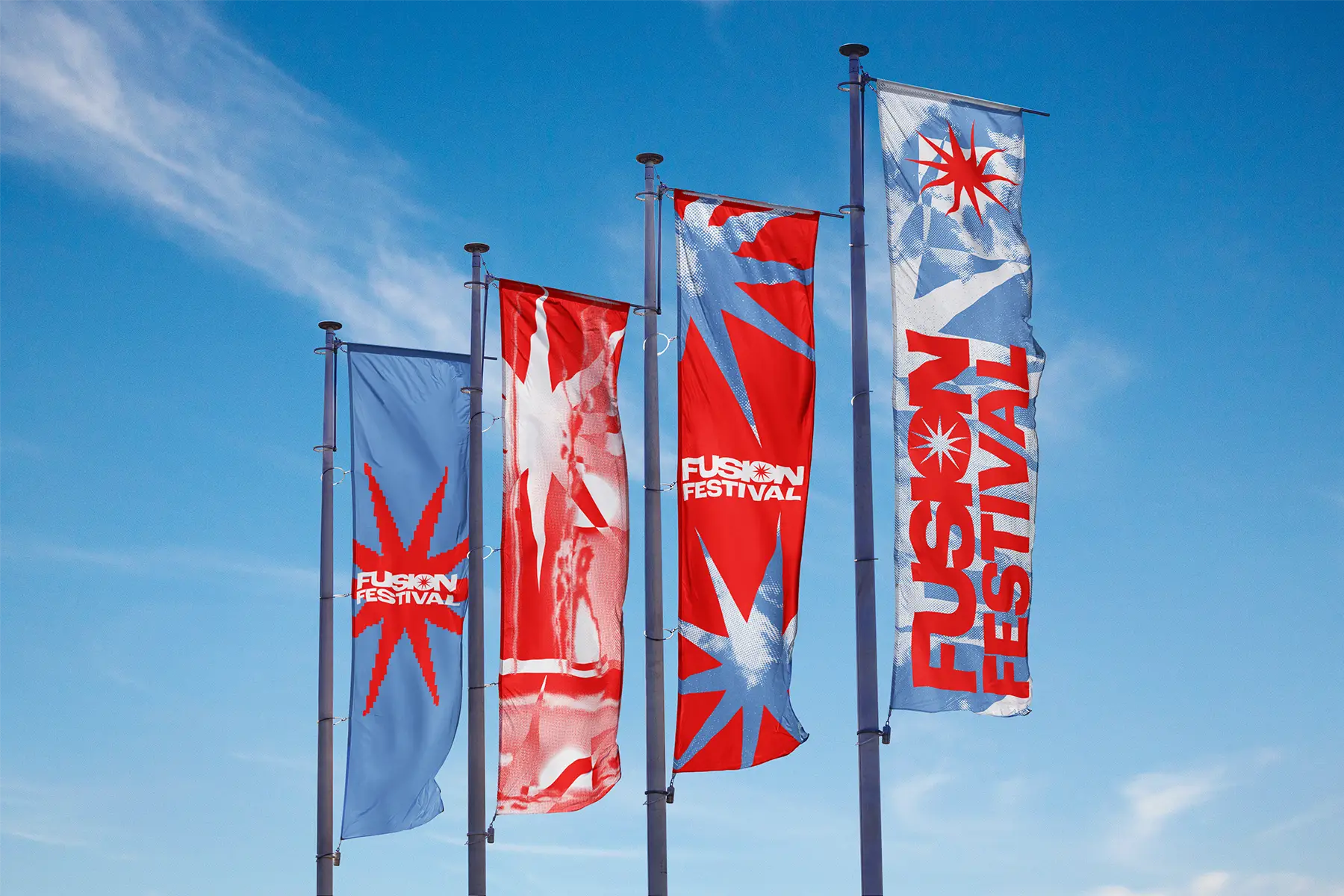
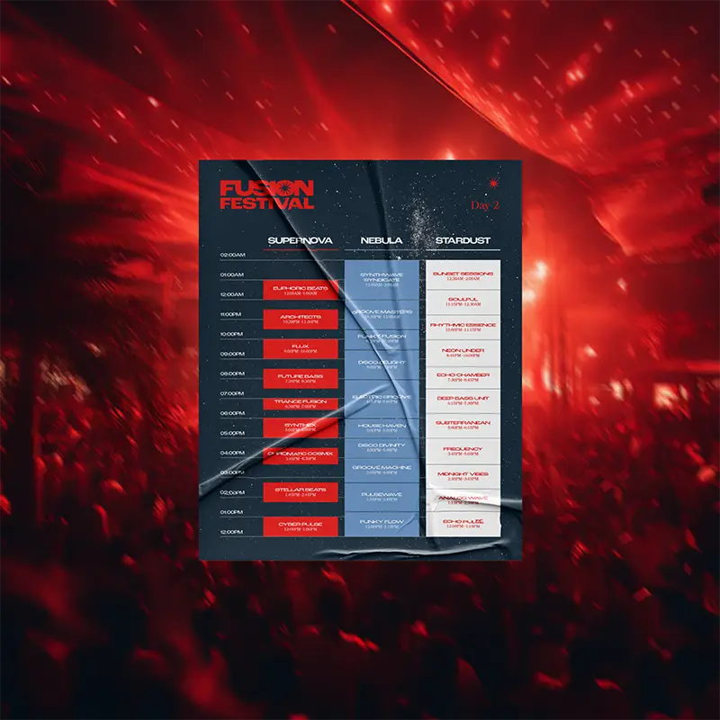
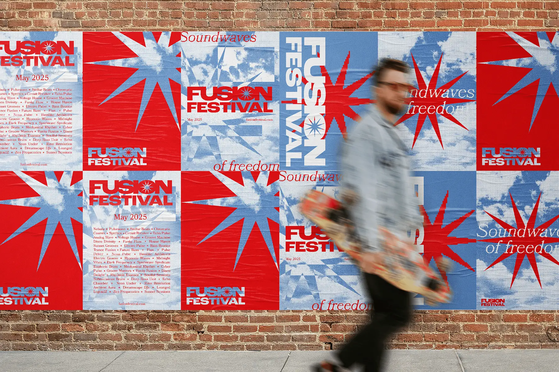
Fusion Festival is a conceptual electronic music event with a complete visual identity built around a scientific metaphor: nuclear fusion (the process that powers stars). The result is a brand system that departs from the dark, industrial aesthetics that dominate the genre, and establishes a bold, youthful presence across advertising collateral, merchandise, signage and digital applications.

REPRESENTING BELONGING THROUGH… PHYSICS?The self-initiated brief was to design a complete festival identity for an electronic music event positioned within the Australian festival scene: logo, advertising collateral, merchandise, signage, social media, ticketing platform and wayfinding. The brief was built around the argument that an EDM event could be vibrant and accessible without losing credibility with its audience.
The name 'Fusion' carries two meanings: the scientific process of combining atomic nuclei to release energy, and the broader act of uniting diverse elements. The festival's identity draws from both: the physics of stars, and the experience of being surrounded by people who chose the same music.
REPRESENTING BELONGING THROUGH… PHYSICS?The self-initiated brief was to design a complete festival identity for an electronic music event positioned within the Australian festival scene: logo, advertising collateral, merchandise, signage, social media, ticketing platform and wayfinding. The brief was built around the argument that an EDM event could be vibrant and accessible without losing credibility with its audience.
The name 'Fusion' carries two meanings: the scientific process of combining atomic nuclei to release energy, and the broader act of uniting diverse elements. The festival's identity draws from both: the physics of stars, and the experience of being surrounded by people who chose the same music.
REPRESENTING BELONGING THROUGH… PHYSICS?The self-initiated brief was to design a complete festival identity for an electronic music event positioned within the Australian festival scene: logo, advertising collateral, merchandise, signage, social media, ticketing platform and wayfinding. The brief was built around the argument that an EDM event could be vibrant and accessible without losing credibility with its audience.
The name 'Fusion' carries two meanings: the scientific process of combining atomic nuclei to release energy, and the broader act of uniting diverse elements. The festival's identity draws from both: the physics of stars, and the experience of being surrounded by people who chose the same music.
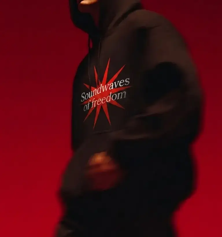
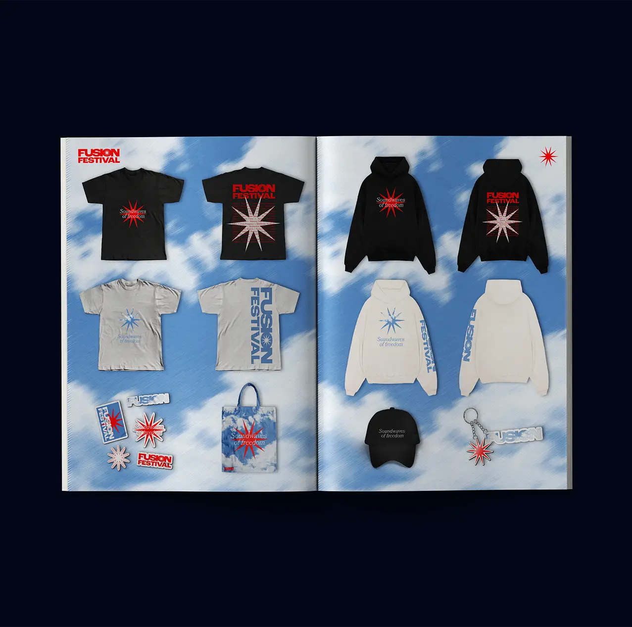

BRINGING THE HEATIn a genre where dark palettes, embellished typography and industrial textures are the default, departing from those conventions risks the work reading as naive or off-brand. The colour palette was loosely drawn from the temperature range of stars, making it scientifically grounded (or airborne, depending on how you look at it). To prevent the bold block lettering and bright colours from reading as childish, the palette was paired with textures, halftone patterns and sharp edges to add visual interest without pulling the visuals too far into science territory.
The star motif functions across Fusion’s identity as a geometric element, a visual shorthand for the concept of fusion (many points converging to make a whole), and a literal reference to the scientific process at its core. Sky and celestial imagery runs through the broader visual language too, tracing the arc of a festival day from daylight to starry skies.
BRINGING THE HEATIn a genre where dark palettes, embellished typography and industrial textures are the default, departing from those conventions risks the work reading as naive or off-brand. The colour palette was loosely drawn from the temperature range of stars, making it scientifically grounded (or airborne, depending on how you look at it). To prevent the bold block lettering and bright colours from reading as childish, the palette was paired with textures, halftone patterns and sharp edges to add visual interest without pulling the visuals too far into science territory.
The star motif functions across Fusion’s identity as a geometric element, a visual shorthand for the concept of fusion (many points converging to make a whole), and a literal reference to the scientific process at its core. Sky and celestial imagery runs through the broader visual language too, tracing the arc of a festival day from daylight to starry skies.
BRINGING THE HEATIn a genre where dark palettes, embellished typography and industrial textures are the default, departing from those conventions risks the work reading as naive or off-brand. The colour palette was loosely drawn from the temperature range of stars, making it scientifically grounded (or airborne, depending on how you look at it). To prevent the bold block lettering and bright colours from reading as childish, the palette was paired with textures, halftone patterns and sharp edges to add visual interest without pulling the visuals too far into science territory.
The star motif functions across Fusion’s identity as a geometric element, a visual shorthand for the concept of fusion (many points converging to make a whole), and a literal reference to the scientific process at its core. Sky and celestial imagery runs through the broader visual language too, tracing the arc of a festival day from daylight to starry skies.

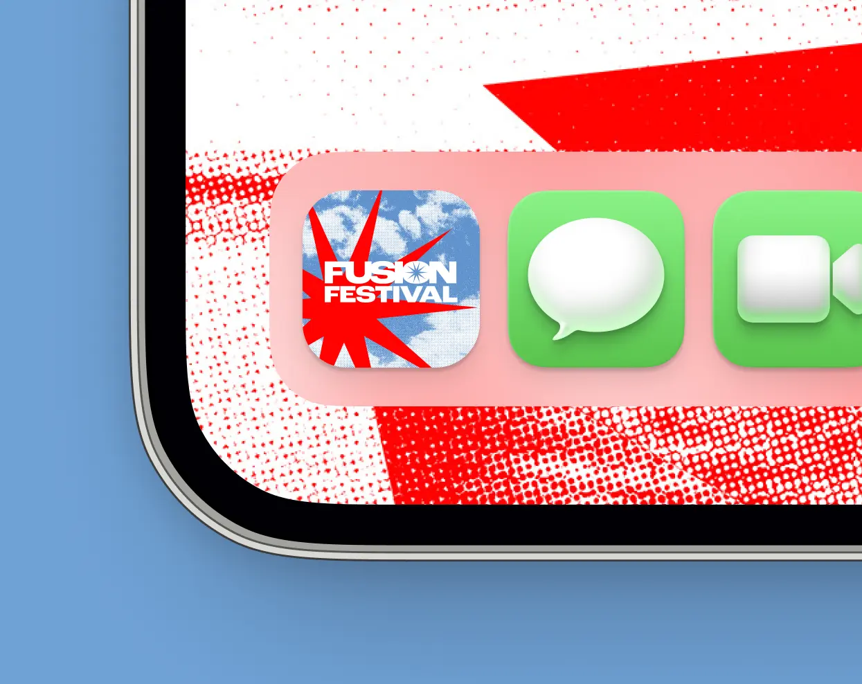
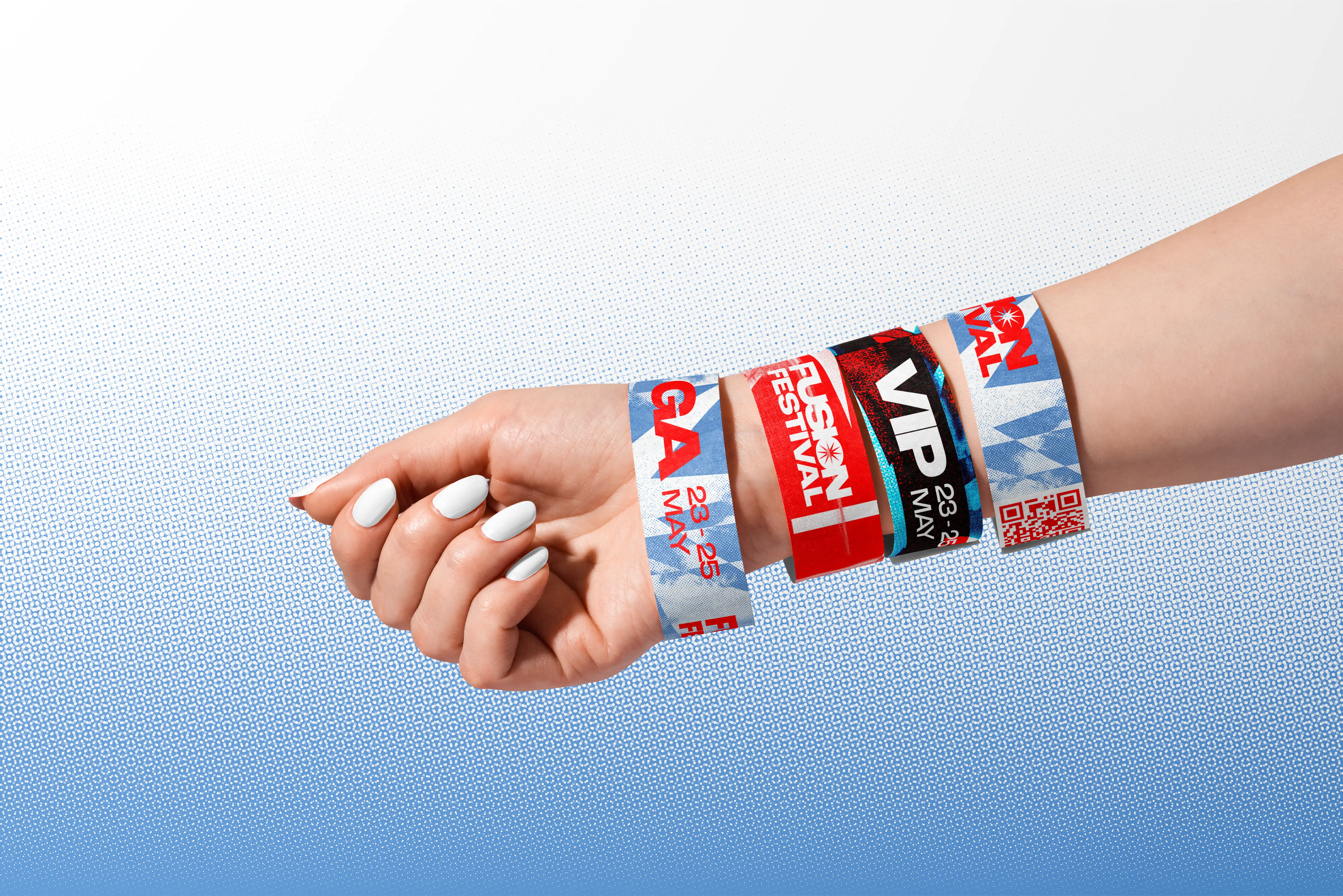
ResultThe bold colour palette, star motif and celestial-inspired visual language form a consistent foundation across Fusion's brand collateral. The identity positions the festival as experiential and accessible, which is the argument the brief set out to make. Beyond unique brand positioning aspects such as ticket tier naming by stellar type and stage names drawn from the physics of fusion, the scientific metaphor lends itself to a wide range of further applications and is built to extend.
ResultThe bold colour palette, star motif and celestial-inspired visual language form a consistent foundation across Fusion's brand collateral. The identity positions the festival as experiential and accessible, which is the argument the brief set out to make. Beyond unique brand positioning aspects such as ticket tier naming by stellar type and stage names drawn from the physics of fusion, the scientific metaphor lends itself to a wide range of further applications and is built to extend.
ResultThe bold colour palette, star motif and celestial-inspired visual language form a consistent foundation across Fusion's brand collateral. The identity positions the festival as experiential and accessible, which is the argument the brief set out to make. Beyond unique brand positioning aspects such as ticket tier naming by stellar type and stage names drawn from the physics of fusion, the scientific metaphor lends itself to a wide range of further applications and is built to extend.