2024/26
Data Visualisation
Data Visualisation
University Project
Australia's Endangered Wildlife
Australia is home to over 150,000 species and is losing them faster than nearly anywhere else on earth. This two-part project translates a complex national dataset into a large-scale poster and an interactive website, designed to communicate the urgency of Australia's wildlife crisis through data.
PT. 1Poster
PT. 1Poster
PT. 1Poster
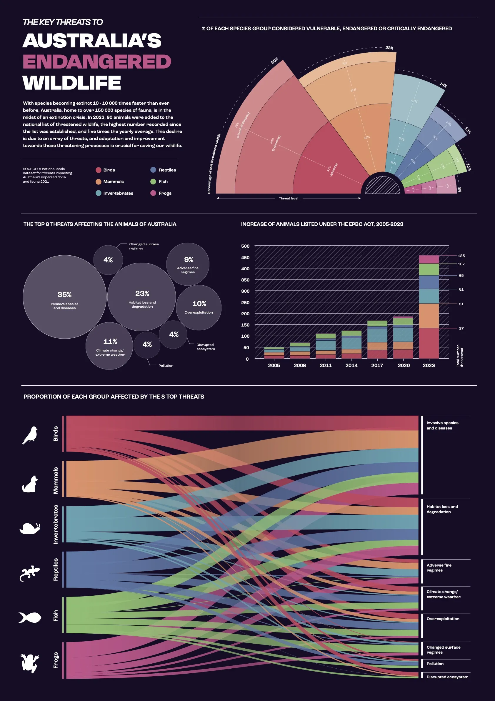
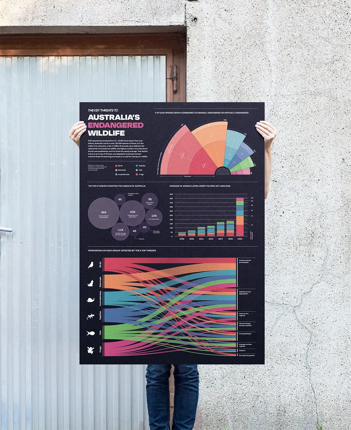
WHY IS AUSTRALIA'S WILDLIFE DECLINING?The data at the centre of this project comes from a national-scale study on the threats impacting Australia's flora and fauna, drawn from the Australian Government's Species, Profile and Threats (SPRAT) database. After initial data analysis using spreadsheet and charting software, I chose to highlight three key points: the species groups most at risk, what's driving that risk, and how rapidly the situation is worsening.
Charts were built in Excel as reference points, then reconstructed in Adobe Illustrator to ensure accuracy with full visual control. The colour palette was tested across four colour blindness simulators to ensure the poster remained readable without reliance on colour alone.
WHY IS AUSTRALIA'S WILDLIFE DECLINING?The data at the centre of this project comes from a national-scale study on the threats impacting Australia's flora and fauna, drawn from the Australian Government's Species, Profile and Threats (SPRAT) database. After initial data analysis using spreadsheet and charting software, I chose to highlight three key points: the species groups most at risk, what's driving that risk, and how rapidly the situation is worsening.
Charts were built in Excel as reference points, then reconstructed in Adobe Illustrator to ensure accuracy with full visual control. The colour palette was tested across four colour blindness simulators to ensure the poster remained readable without reliance on colour alone.
WHY IS AUSTRALIA'S WILDLIFE DECLINING?The data at the centre of this project comes from a national-scale study on the threats impacting Australia's flora and fauna, drawn from the Australian Government's Species, Profile and Threats (SPRAT) database. After initial data analysis using spreadsheet and charting software, I chose to highlight three key points: the species groups most at risk, what's driving that risk, and how rapidly the situation is worsening.
Charts were built in Excel as reference points, then reconstructed in Adobe Illustrator to ensure accuracy with full visual control. The colour palette was tested across four colour blindness simulators to ensure the poster remained readable without reliance on colour alone.
Pt. 2Website
Pt. 2Website
Pt. 2Website
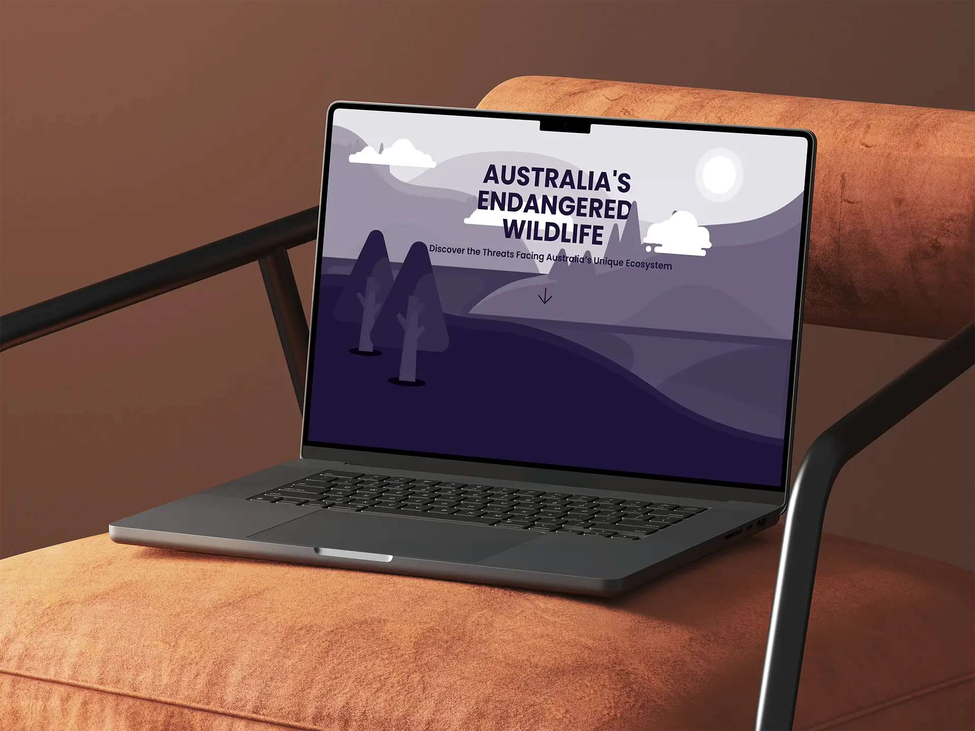
MAKING DATA ENGAGINGPart two extended the dataset through a scroll-driven, parallax-style website, designed to let viewers move through the data one section at a time. The site was originally built in Vev, a no-code web platform, in 2024. After losing access to the account where it was hosted, I rebuilt the project using Framer in early 2026, using that process to address responsiveness issues and take advantage of developments in the platform since the original build.
The final website moves viewers through Australia's wildlife crisis section by section, beginning with the scale of the problem before narrowing into specific species, threats and actions. The illustrated background, which was created in Adobe Illustrator in a monochrome palette, moves independently of the content as viewers scroll, creating depth without competing with the data.
MAKING DATA ENGAGINGPart two extended the dataset through a scroll-driven, parallax-style website, designed to let viewers move through the data one section at a time. The site was originally built in Vev, a no-code web platform, in 2024. After losing access to the account where it was hosted, I rebuilt the project using Framer in early 2026, using that process to address responsiveness issues and take advantage of developments in the platform since the original build.
The final website moves viewers through Australia's wildlife crisis section by section, beginning with the scale of the problem before narrowing into specific species, threats and actions. The illustrated background, which was created in Adobe Illustrator in a monochrome palette, moves independently of the content as viewers scroll, creating depth without competing with the data.
MAKING DATA ENGAGINGPart two extended the dataset through a scroll-driven, parallax-style website, designed to let viewers move through the data one section at a time. The site was originally built in Vev, a no-code web platform, in 2024. After losing access to the account where it was hosted, I rebuilt the project using Framer in early 2026, using that process to address responsiveness issues and take advantage of developments in the platform since the original build.
The final website moves viewers through Australia's wildlife crisis section by section, beginning with the scale of the problem before narrowing into specific species, threats and actions. The illustrated background, which was created in Adobe Illustrator in a monochrome palette, moves independently of the content as viewers scroll, creating depth without competing with the data.