2024
Editorial Design
Editorial Design
Professional Role
Curieux Magazine
Curieux is the University of Canberra's student-led magazine. As part of the production team, I designed the layout of magazine editions and maintained the visual identity across social media and promotional material. In addition to the three digital editions of Curieux the editorial team releases each year, an annual print edition, titled ‘Best Of’, is used to highlight exemplary student submissions from over the course of the year, with 2024’s edition celebrating writing, visual art and photography work from University of Canberra students.
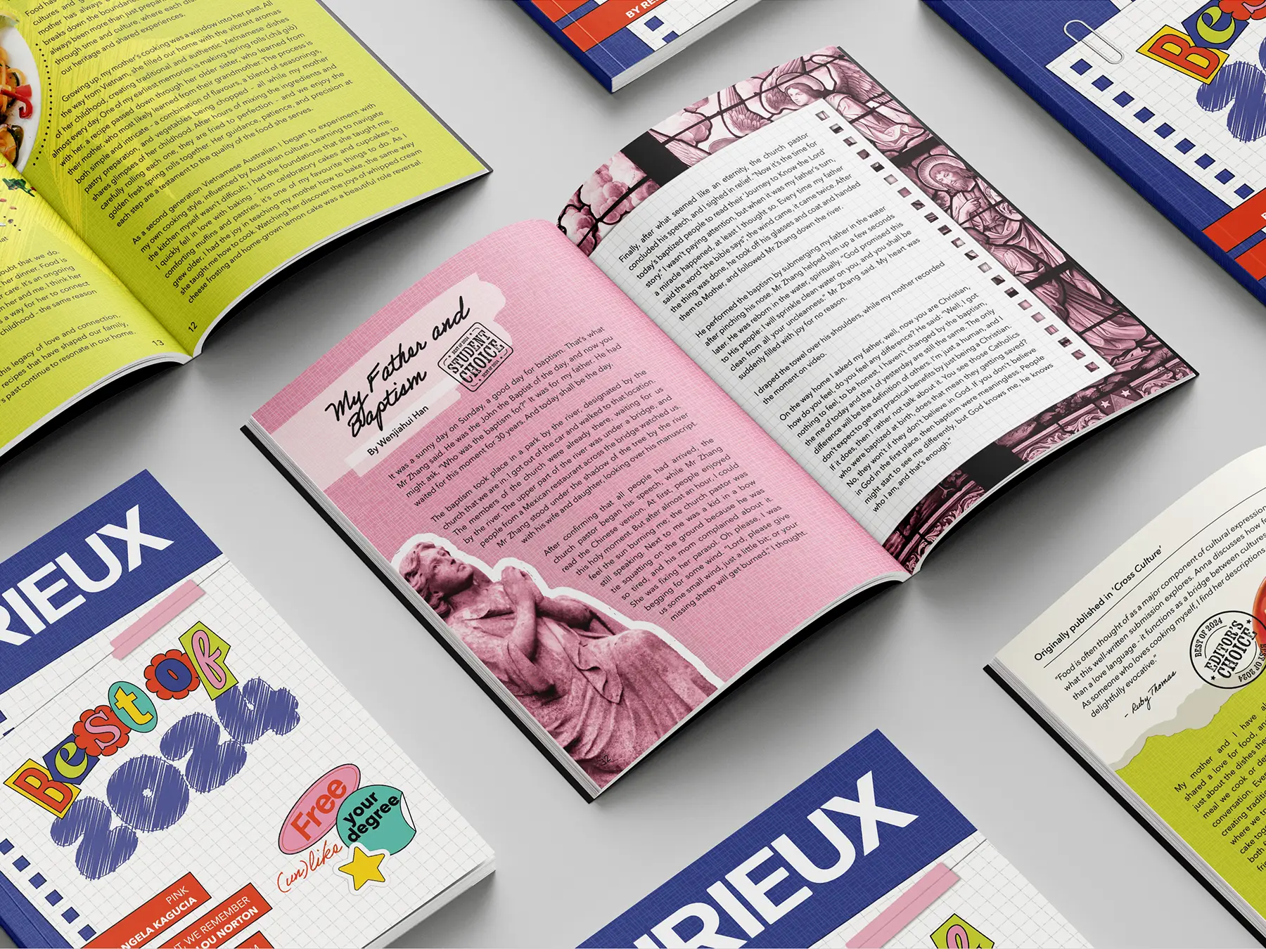
SOMETHING TO KEEPThe issue’s name “Best Of” lends itself towards a superlative themed visual style easily, reinforced through the editor, student and Student Representative Council (SRC) choice stamps used to mark how exemplary pieces were chosen. Curieux’s brand guidelines specify a unique seven-colour palette for each edition, allowing for a distinct identity for each edition. For an issue meant to feel celebratory and capture the breadth of student life, the visual style of 2024’s edition pointed towards a yearbook aesthetic, framing the issue as a keepsake.
SOMETHING TO KEEPThe issue’s name “Best Of” lends itself towards a superlative themed visual style easily, reinforced through the editor, student and Student Representative Council (SRC) choice stamps used to mark how exemplary pieces were chosen. Curieux’s brand guidelines specify a unique seven-colour palette for each edition, allowing for a distinct identity for each edition. For an issue meant to feel celebratory and capture the breadth of student life, the visual style of 2024’s edition pointed towards a yearbook aesthetic, framing the issue as a keepsake.
SOMETHING TO KEEPThe issue’s name “Best Of” lends itself towards a superlative themed visual style easily, reinforced through the editor, student and Student Representative Council (SRC) choice stamps used to mark how exemplary pieces were chosen. Curieux’s brand guidelines specify a unique seven-colour palette for each edition, allowing for a distinct identity for each edition. For an issue meant to feel celebratory and capture the breadth of student life, the visual style of 2024’s edition pointed towards a yearbook aesthetic, framing the issue as a keepsake.

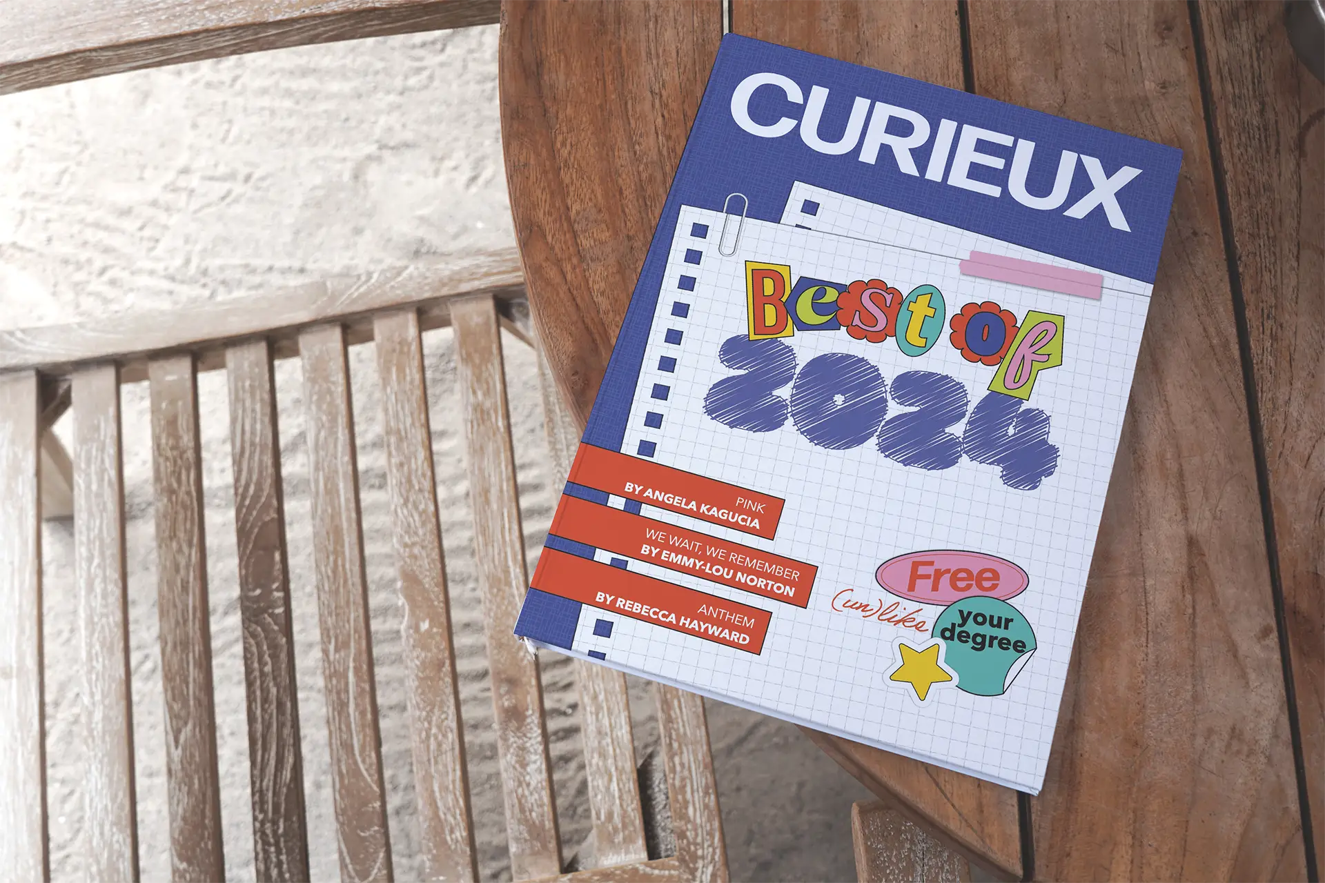
CONTROLLED CHAOSWith submissions spanning different themes, formats and visual styles, the design of the magazine had to unify each piece without flattening the diversity of work it was presenting. The scrapbook direction (cut-and-paste letterforms, collage elements, notebook patterns) was chosen for this reason, holding varied content together through the format itself, reminiscent of the way a student's notebook at the end of a semester holds accumulated work.
CONTROLLED CHAOSWith submissions spanning different themes, formats and visual styles, the design of the magazine had to unify each piece without flattening the diversity of work it was presenting. The scrapbook direction (cut-and-paste letterforms, collage elements, notebook patterns) was chosen for this reason, holding varied content together through the format itself, reminiscent of the way a student's notebook at the end of a semester holds accumulated work.
CONTROLLED CHAOSWith submissions spanning different themes, formats and visual styles, the design of the magazine had to unify each piece without flattening the diversity of work it was presenting. The scrapbook direction (cut-and-paste letterforms, collage elements, notebook patterns) was chosen for this reason, holding varied content together through the format itself, reminiscent of the way a student's notebook at the end of a semester holds accumulated work.
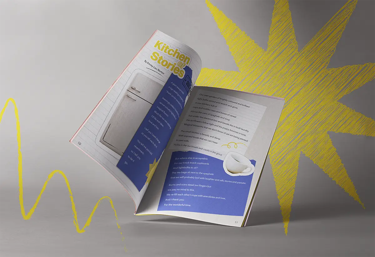
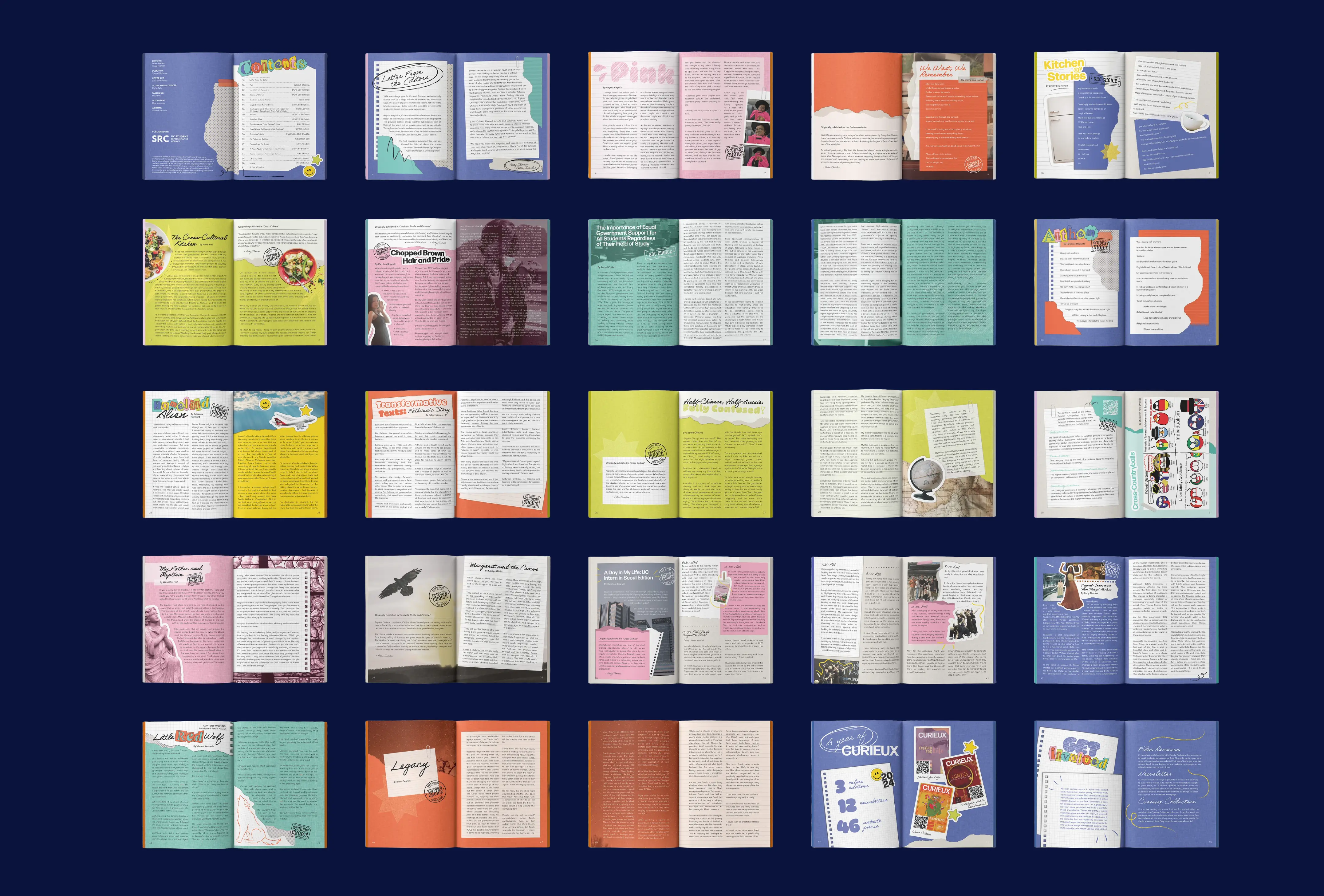
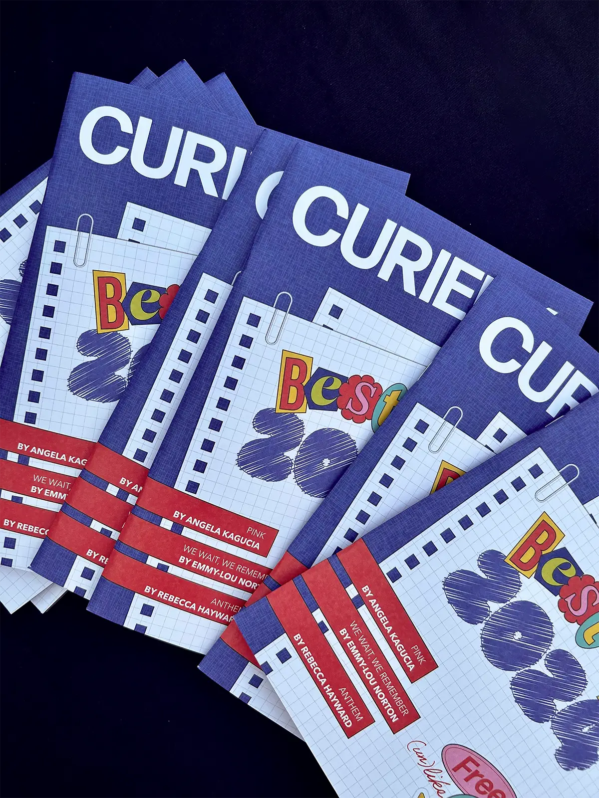
ResultThe final print edition uses ransom letter-style typography, bold colour blocking and patterns to give each spread its own personality within a consistent structure. The file was prepared as a print-ready document and distributed at University of Canberra end-of-year and orientation events, as well as across campus displays.
ResultThe final print edition uses ransom letter-style typography, bold colour blocking and patterns to give each spread its own personality within a consistent structure. The file was prepared as a print-ready document and distributed at University of Canberra end-of-year and orientation events, as well as across campus displays.
ResultThe final print edition uses ransom letter-style typography, bold colour blocking and patterns to give each spread its own personality within a consistent structure. The file was prepared as a print-ready document and distributed at University of Canberra end-of-year and orientation events, as well as across campus displays.
