2024
Brand Identity
Brand Identity
Client Project
Pretty Energy Aesthetics
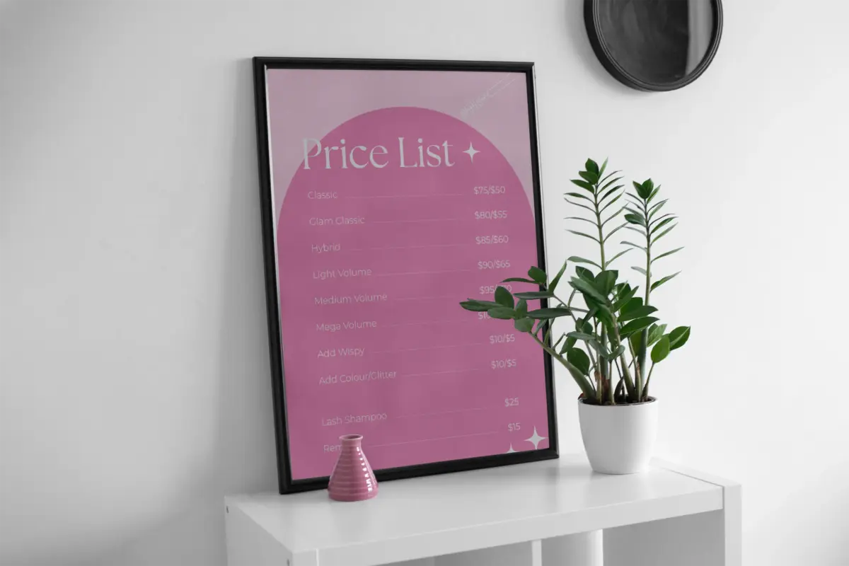
Pretty Energy Aesthetics is a Canberra-based beauty and lash business run by founder Bree. As an already established business in a competitive local market, Bree needed a brand refresh that modernised and professionalised her brand’s identity without sacrificing the recognition she had built.
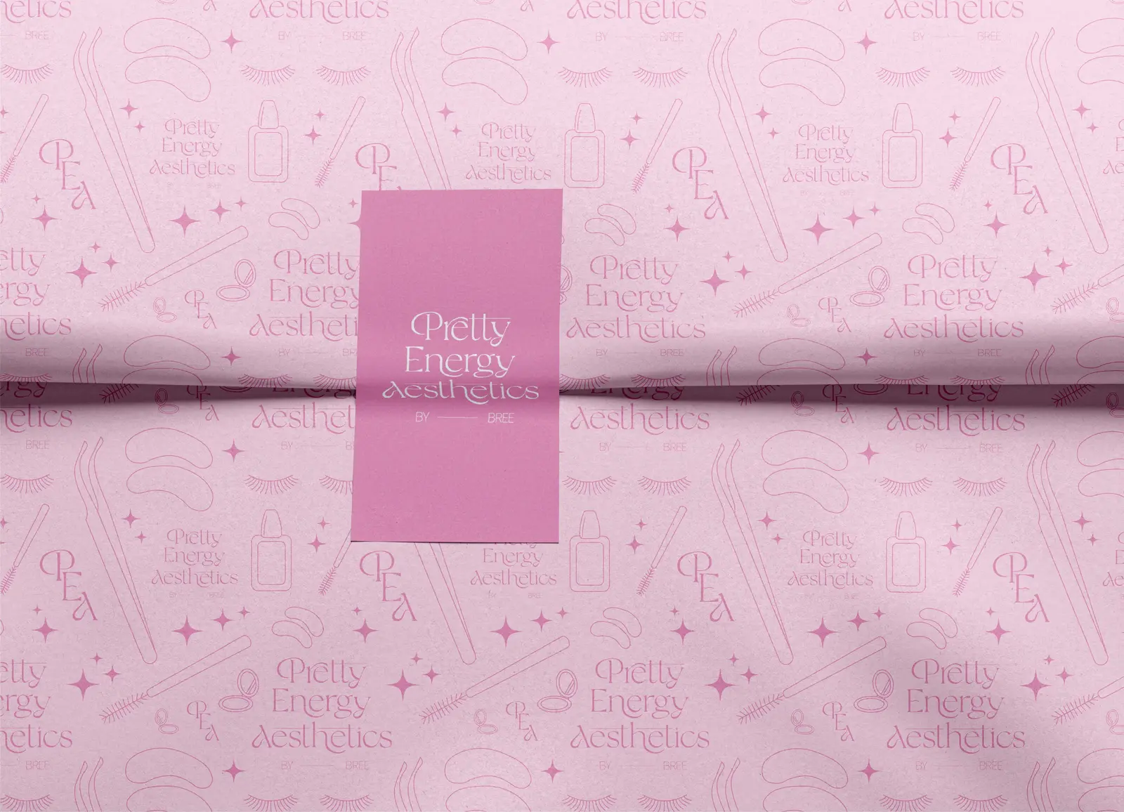
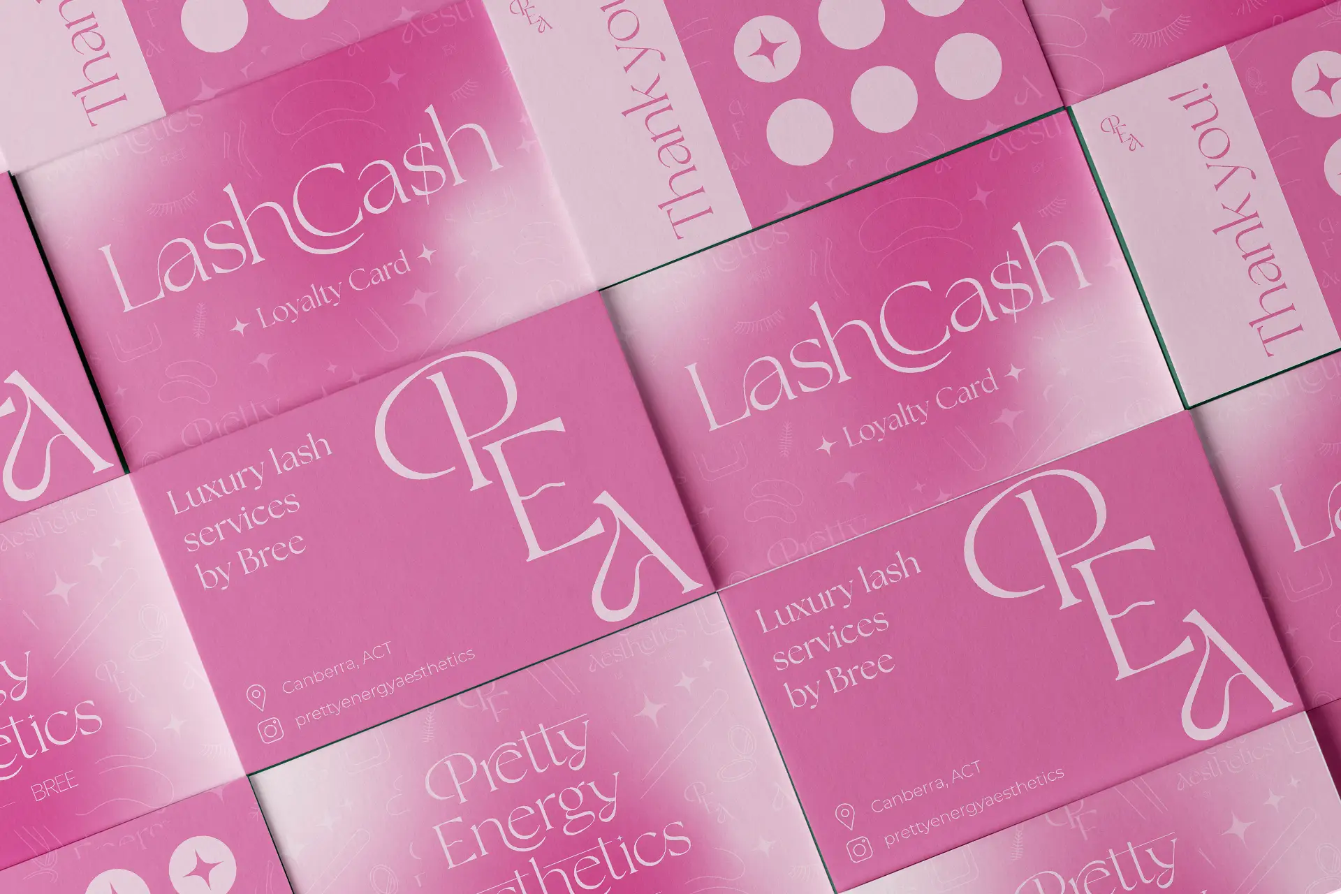
MAINTAINING BRAND RECOGNISABILITYThe project called for a full brand identity, including a logo, brand guidelines, social media templates and print design. With a loyal client-base, the challenge was not in retention, but in positioning Pretty Energy Aesthetics as a reliable, professional service that was recognisable at a glance. With only the core constraint being the use of pink, the brand was built upon and that loyalty recognised through the introduction of tangible loyalty cards.
MAINTAINING BRAND RECOGNISABILITYThe project called for a full brand identity, including a logo, brand guidelines, social media templates and print design. With a loyal client-base, the challenge was not in retention, but in positioning Pretty Energy Aesthetics as a reliable, professional service that was recognisable at a glance. With only the core constraint being the use of pink, the brand was built upon and that loyalty recognised through the introduction of tangible loyalty cards.
MAINTAINING BRAND RECOGNISABILITYThe project called for a full brand identity, including a logo, brand guidelines, social media templates and print design. With a loyal client-base, the challenge was not in retention, but in positioning Pretty Energy Aesthetics as a reliable, professional service that was recognisable at a glance. With only the core constraint being the use of pink, the brand was built upon and that loyalty recognised through the introduction of tangible loyalty cards.
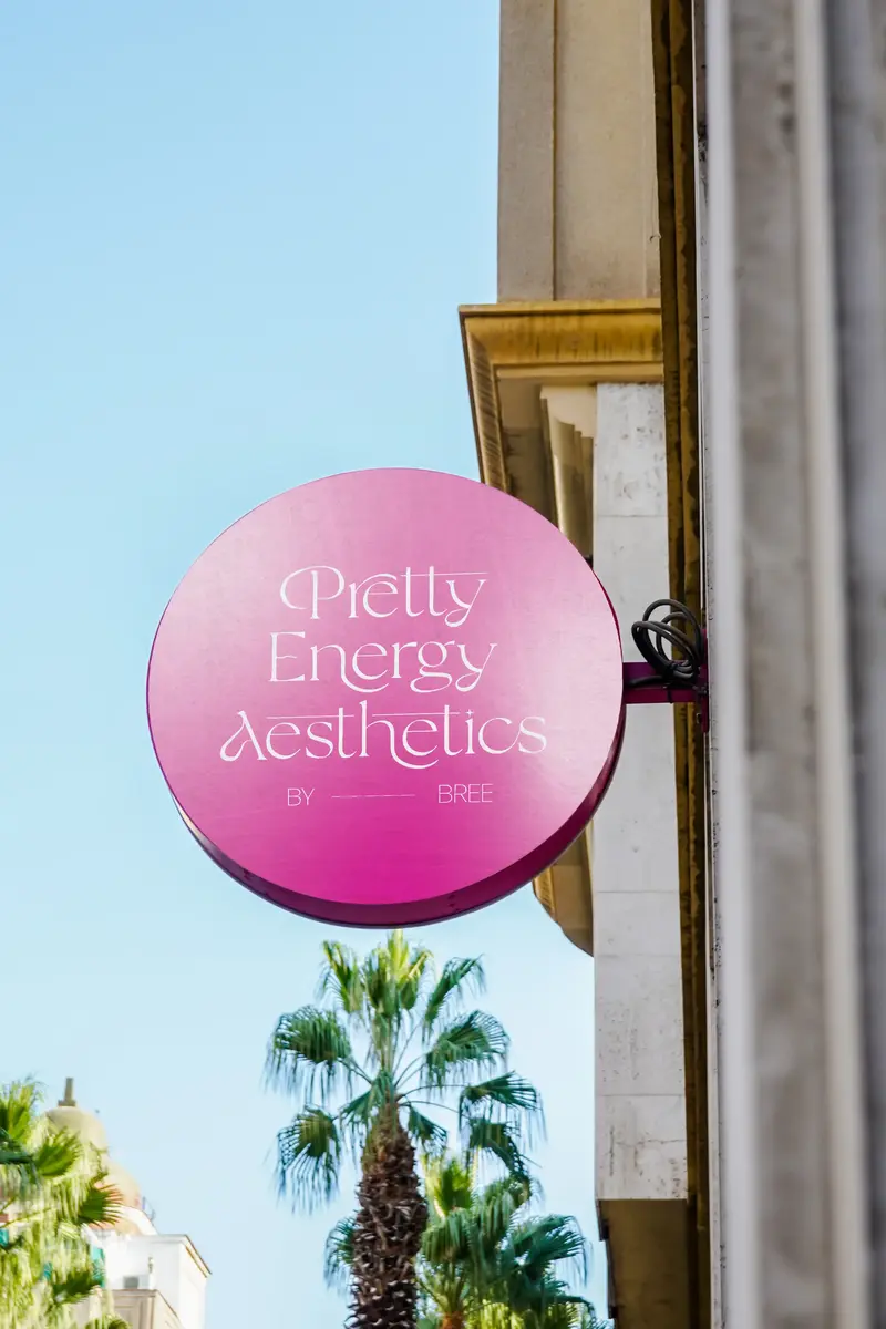
DESIGNING FOR THE FUTURERefreshing a brand for an established small business meant that client recognition had already been built around an existing visual direction, however inconsistently applied, and the refresh needed to build on that rather than replace it.
For a small business owner without a design background, a brand system is only useful if it can be implemented independently after the project ends. Font selections were made from typefaces accessible and licensable outside professional software, social media templates were delivered in Canva, and a written how-to guide was provided alongside the brand assets, covering which elements to use where and how to maintain consistency across applications.
DESIGNING FOR THE FUTURERefreshing a brand for an established small business meant that client recognition had already been built around an existing visual direction, however inconsistently applied, and the refresh needed to build on that rather than replace it.
For a small business owner without a design background, a brand system is only useful if it can be implemented independently after the project ends. Font selections were made from typefaces accessible and licensable outside professional software, social media templates were delivered in Canva, and a written how-to guide was provided alongside the brand assets, covering which elements to use where and how to maintain consistency across applications.
DESIGNING FOR THE FUTURERefreshing a brand for an established small business meant that client recognition had already been built around an existing visual direction, however inconsistently applied, and the refresh needed to build on that rather than replace it.
For a small business owner without a design background, a brand system is only useful if it can be implemented independently after the project ends. Font selections were made from typefaces accessible and licensable outside professional software, social media templates were delivered in Canva, and a written how-to guide was provided alongside the brand assets, covering which elements to use where and how to maintain consistency across applications.
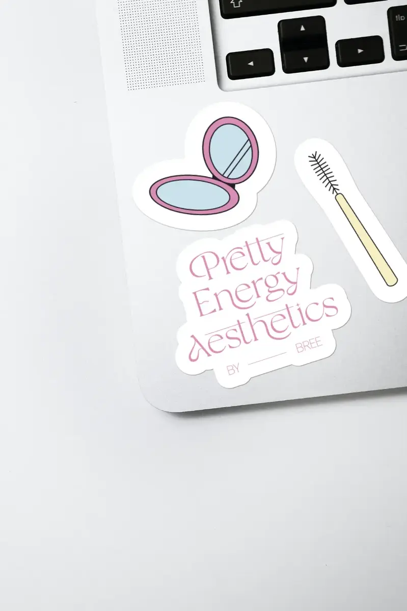
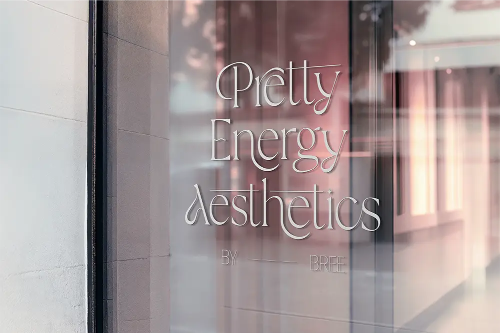
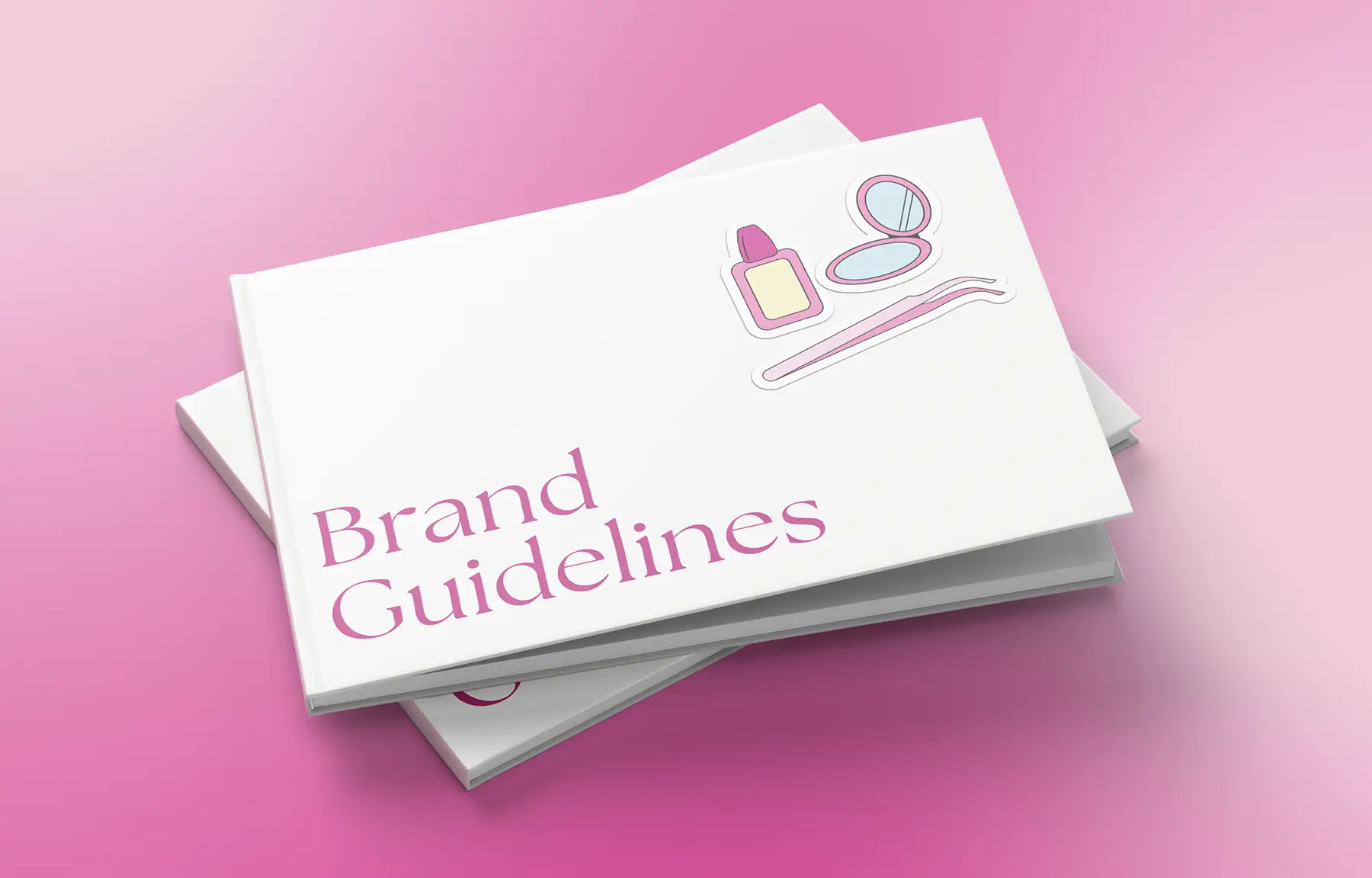
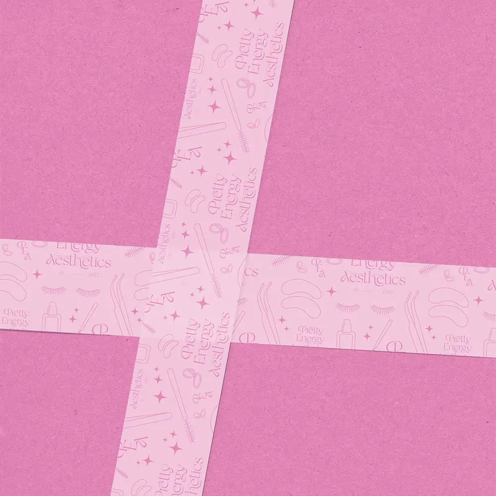
ResultThe final brand identity of Pretty Energy Aesthetics retains the soft, feminine branding that the previous visuals aimed to embody, but with a defined system of typography, colours and visual elements that provide an extra level of professionalism and allow the brand to show up consistently across both physical and digital applications.
ResultThe final brand identity of Pretty Energy Aesthetics retains the soft, feminine branding that the previous visuals aimed to embody, but with a defined system of typography, colours and visual elements that provide an extra level of professionalism and allow the brand to show up consistently across both physical and digital applications.
ResultThe final brand identity of Pretty Energy Aesthetics retains the soft, feminine branding that the previous visuals aimed to embody, but with a defined system of typography, colours and visual elements that provide an extra level of professionalism and allow the brand to show up consistently across both physical and digital applications.