2024/26
Brand Identity & Rebranding
Brand Identity & Rebranding
University Project
Lazuli Luxury Development
Lazuli Luxury Development is a conceptual hotel and development brand built around the idea that exceptional accommodation is more than just a place to sleep. While initial branding was designed in response to a second-year university brief, a review of Lazuli’s visual identity in 2026 revealed opportunities for improvement that better reflect its core values and challenge the materialistic view of luxury.

THE BRIEF: WHAT DOES A DEVELOPMENT COMPANY EVEN DO?The brief called for a complete brand identity for an original building development company. So what even is a development company? That was my first question when faced with this brief. I chose to develop a luxury hotel company, naming the brand Lazuli (from “lapis lazuli”) to evoke luxury and prestige. The target audience was high-end: people seeking unique experiences alongside premium hospitality. The positioning, “more than just a room”, comes from the question about what a development company actually stands for when the buildings they create outlast any individual experience within them.
THE BRIEF: WHAT DOES A DEVELOPMENT COMPANY EVEN DO?The brief called for a complete brand identity for an original building development company. So what even is a development company? That was my first question when faced with this brief. I chose to develop a luxury hotel company, naming the brand Lazuli (from “lapis lazuli”) to evoke luxury and prestige. The target audience was high-end: people seeking unique experiences alongside premium hospitality. The positioning, “more than just a room”, comes from the question about what a development company actually stands for when the buildings they create outlast any individual experience within them.
THE BRIEF: WHAT DOES A DEVELOPMENT COMPANY EVEN DO?The brief called for a complete brand identity for an original building development company. So what even is a development company? That was my first question when faced with this brief. I chose to develop a luxury hotel company, naming the brand Lazuli (from “lapis lazuli”) to evoke luxury and prestige. The target audience was high-end: people seeking unique experiences alongside premium hospitality. The positioning, “more than just a room”, comes from the question about what a development company actually stands for when the buildings they create outlast any individual experience within them.


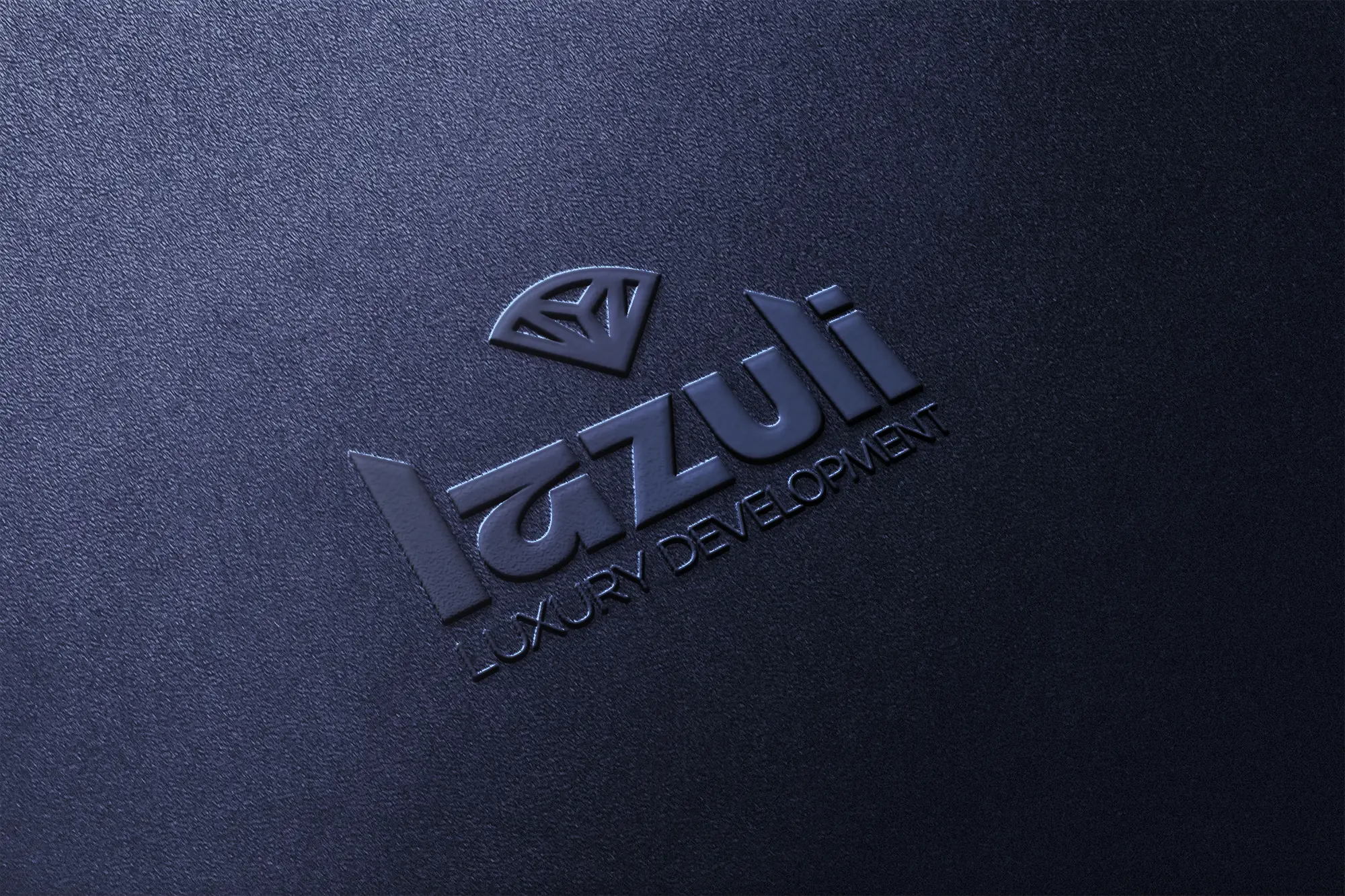
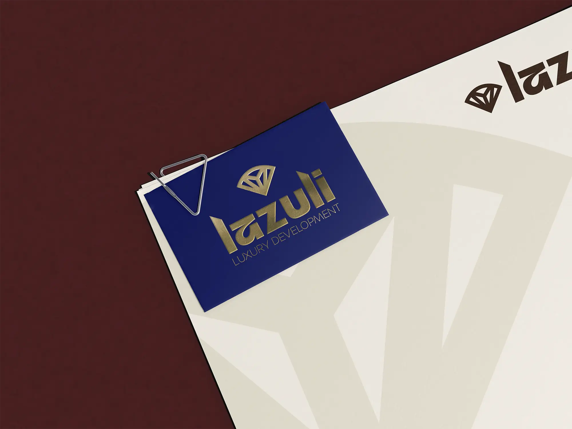
WINDOWS TO ANOTHER WORLDLazuli’s logo uses angled geometry that emulates the slant and structure of buildings, with sharp corners representing modernity and precision. The brand icon represents an abstract idea of a gemstone, as a nod to the ‘Lazuli’ name, while also drawing inspiration from the framing of windows, historically symbolising abundance and intricacy and in a contemporary climate, an obvious piece of any structure.
WINDOWS TO ANOTHER WORLDLazuli’s logo uses angled geometry that emulates the slant and structure of buildings, with sharp corners representing modernity and precision. The brand icon represents an abstract idea of a gemstone, as a nod to the ‘Lazuli’ name, while also drawing inspiration from the framing of windows, historically symbolising abundance and intricacy and in a contemporary climate, an obvious piece of any structure.
WINDOWS TO ANOTHER WORLDLazuli’s logo uses angled geometry that emulates the slant and structure of buildings, with sharp corners representing modernity and precision. The brand icon represents an abstract idea of a gemstone, as a nod to the ‘Lazuli’ name, while also drawing inspiration from the framing of windows, historically symbolising abundance and intricacy and in a contemporary climate, an obvious piece of any structure.
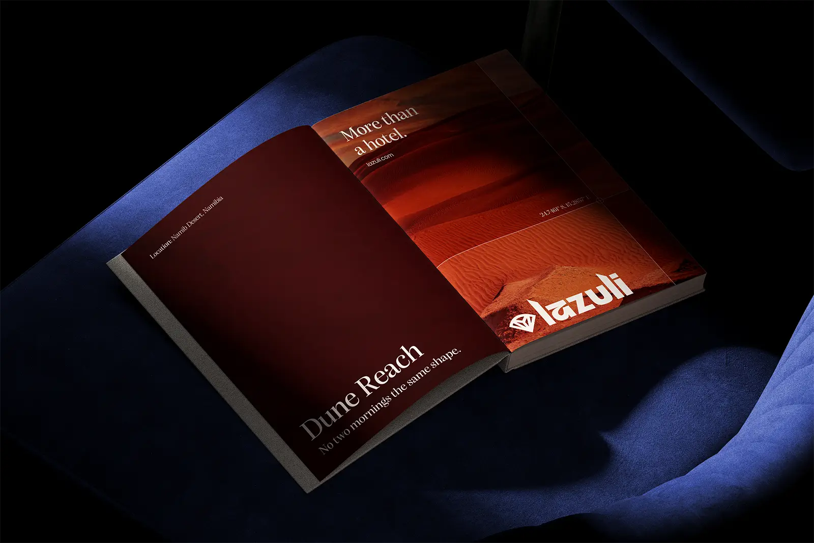

CHALLENGING THE VIEW OF "LUXURY"In an age that leans into technology, material possessions and hyperconsumerism, it’s easy to lose sight of what true luxury is: that of human experience. Lazuli positions themselves as a direct opponent to conventional “luxury”, building unique and exclusive experiences, rather than high-rise hotels. Think a secluded rainforest hotel, a mountainside retreat or a sleep in the clouds (well maybe not that last one… yet).
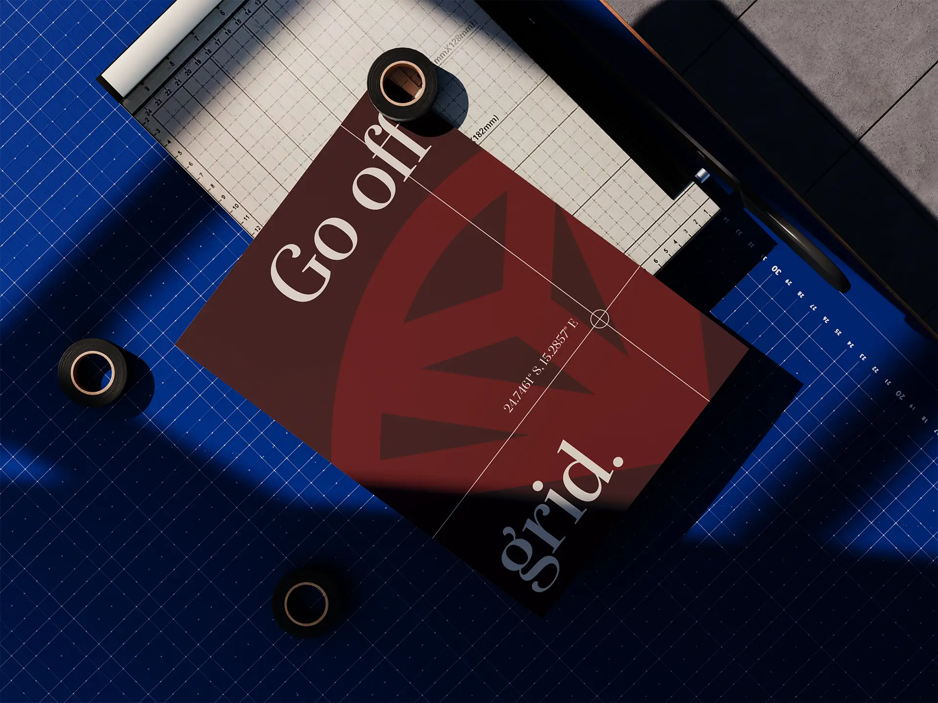
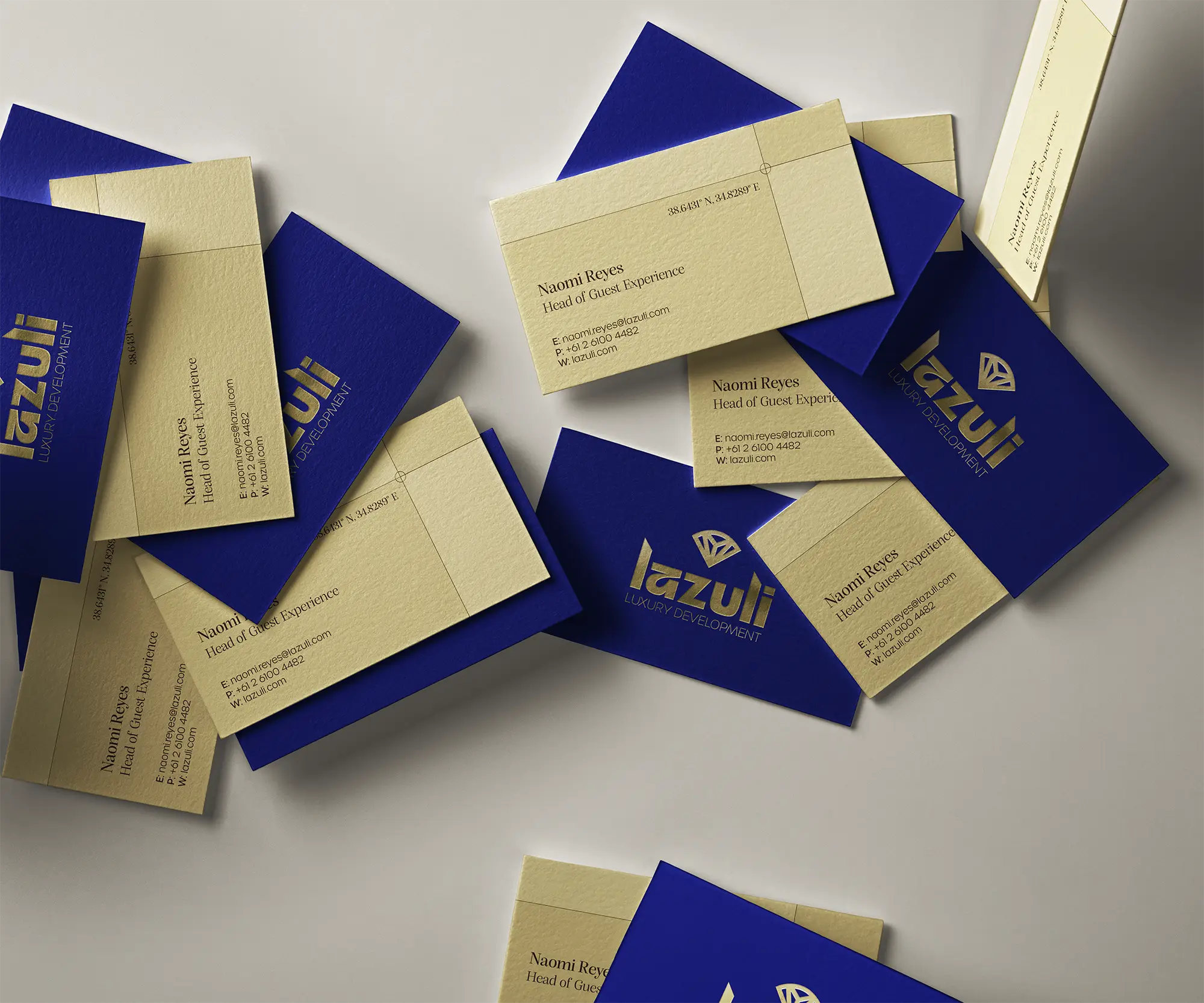
Lazuli’s rebrand departs from the cool-toned, sleek visual identity of prior, leaning instead into the brand’s namesake with gemstone inspired colours and scenic visuals adaptable across a wide range of experiences. Each development is driven by imagery of its surrounding location, placing an emphasis on the experience as a whole rather than its amenities. This imagery is intentionally left vague and minimal, with coordinates acting as a visual device to spark curiosity and maintain exclusivity. The window symbolism is utilised throughout brand collateral, with brand imagery framed within or layered underneath geometric shapes and fine linework functioning as a window to another location.
CHALLENGING THE VIEW OF "LUXURY"In an age that leans into technology, material possessions and hyperconsumerism, it’s easy to lose sight of what true luxury is: that of human experience. Lazuli positions themselves as a direct opponent to conventional “luxury”, building unique and exclusive experiences, rather than high-rise hotels. Think a secluded rainforest hotel, a mountainside retreat or a sleep in the clouds (well maybe not that last one… yet).
Lazuli’s rebrand departs from the cool-toned, sleek visual identity of prior, leaning instead into the brand’s namesake with gemstone inspired colours and scenic visuals adaptable across a wide range of experiences. Each development is driven by imagery of its surrounding location, placing an emphasis on the experience as a whole rather than its amenities. This imagery is intentionally left vague and minimal, with coordinates acting as a visual device to spark curiosity and maintain exclusivity. The window symbolism is utilised throughout brand collateral, with brand imagery framed within or layered underneath geometric shapes and fine linework functioning as a window to another location.
CHALLENGING THE VIEW OF "LUXURY"In an age that leans into technology, material possessions and hyperconsumerism, it’s easy to lose sight of what true luxury is: that of human experience. Lazuli positions themselves as a direct opponent to conventional “luxury”, building unique and exclusive experiences, rather than high-rise hotels. Think a secluded rainforest hotel, a mountainside retreat or a sleep in the clouds (well maybe not that last one… yet).
Lazuli’s rebrand departs from the cool-toned, sleek visual identity of prior, leaning instead into the brand’s namesake with gemstone inspired colours and scenic visuals adaptable across a wide range of experiences. Each development is driven by imagery of its surrounding location, placing an emphasis on the experience as a whole rather than its amenities. This imagery is intentionally left vague and minimal, with coordinates acting as a visual device to spark curiosity and maintain exclusivity. The window symbolism is utilised throughout brand collateral, with brand imagery framed within or layered underneath geometric shapes and fine linework functioning as a window to another location.